Flexbox Solves All
James Kitchens
May 24, 2022
HTML
CSS
I really like when I get to see clear progress in my programming abilities. When I first created this website, I had relatively little experience with website design, so I was drawing a lot of code and inspiration from YouTube tutorials and Stack Overflow. There are a few aspects of the website that I would categorize as “good enough”, falling so perfectly at the intersection of annoyance and complacency that they will likely never be updated. But there was one particular issue that has always bothered me… the blog post thumbnail images.
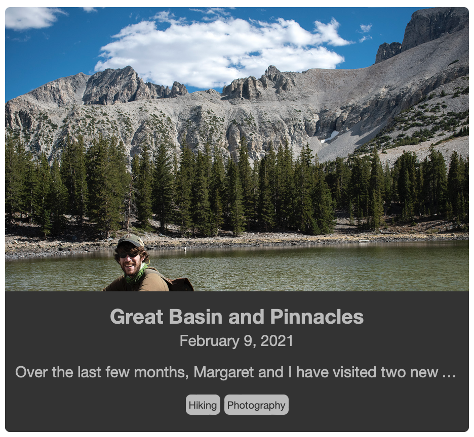
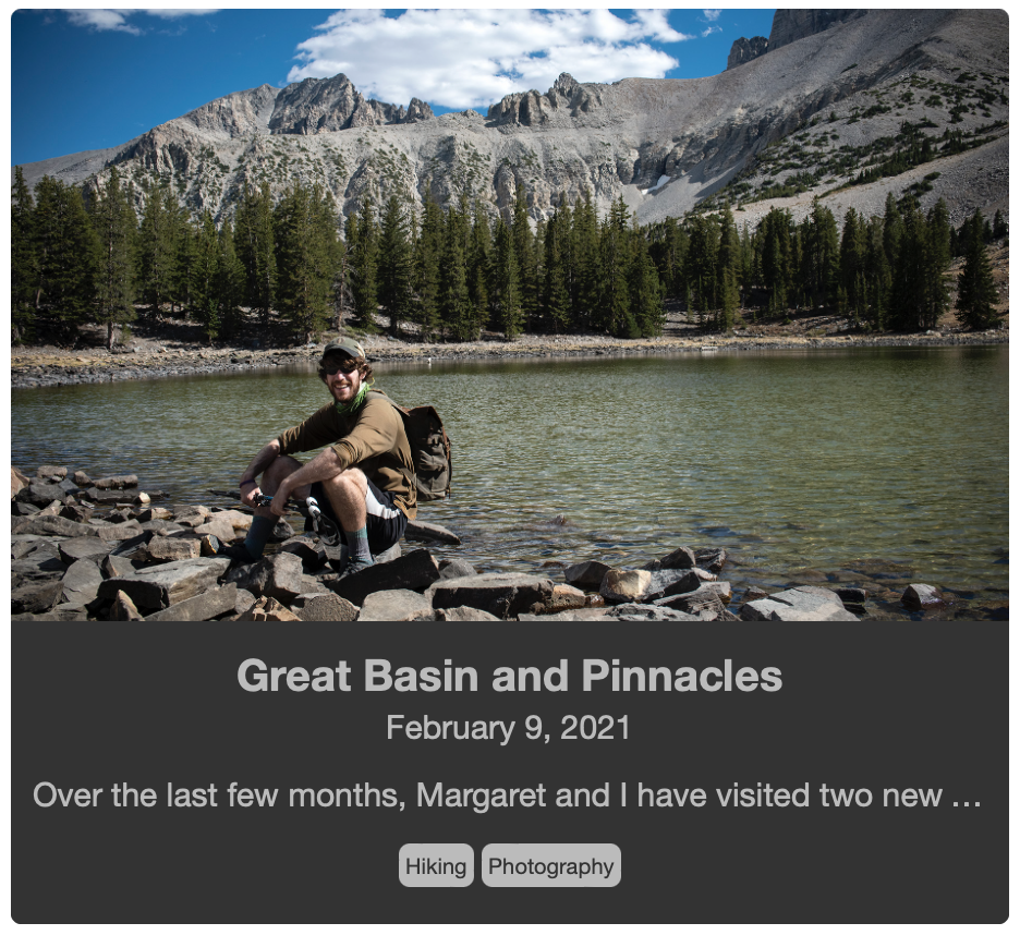
The blog post cards consist of a thumbnail and an information section, including title, date, short description, and categories. These thumbnails are meant to give users a look at a projects and break up the text blocks. The information section has a variable height, depending on the length of the content inside. The thumbnail image then fills the rest of the card; I scale the image up to fully cover the available space within the div. Up to today, an outline of my method for handling this was as follows:
blog.html
<div class="card">
    <div class="postimg" style="background-image: url('')">
        <div class="info"></div>
        <a href="" class="overlay"></a>
    </div>
</div>
The thumbnail image was included as a background-image of the card, and then the info section overlaid on top using position: absolute;. The overlay on hover added yet another layer. This covered nearly all of my needs as the thumbnail did then fill any space above the info section. The main issue with this method is that it is very difficult to control which section of the thumbnail is shown, as the info section is covering a decent proportion of the image. Certain images worked really well and others were a bit more abstract.
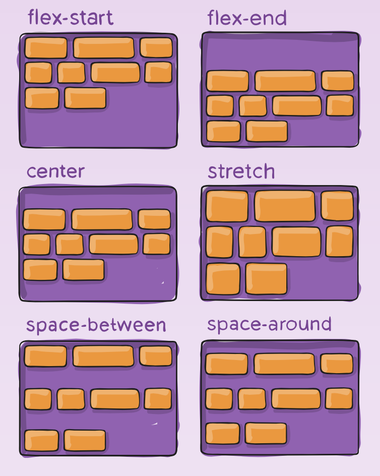
Now that I’ve had more experience, I decided to return and update this styling and structure to a CSS flexbox layout. The advantage of flexbox is that you can designate a div to fill any empty space leftover within a containing div.
blog.html
<div class="card">
    <div class="flexing">
        <div class="thumbnail" style="background-image: url('');"></div>
        <div class="info"></div>
        <a href="" class="overlay"></a>
    </div>
</div>
Now all of the div are within a flex container, rather than being on separate levels in the hierarchy. The on hover overlay is still treated as a relatively separate div; in the styling, it have the position: absolute; property to go on top of everything. And speaking of styling, all of the flexbox properties are found within the corresponding .scss file.
blog.scss
.card {
    margin: 10px;
    height: 420px;
}

.flexing {
    position: relative;
    border-radius: 5px;
    border: 0px;
    padding: 0px;
    height: 100%;
    width: 100%;
    background-color: black;
    display: flex;
    flex-direction: column;
    justify-content: flex-end;
}

.thumbnail {
    background-position: center;
    background-repeat: no-repeat;
    background-size: cover;
    flex-grow: 2;
    margin: 0px;
    padding: 0px;
    border: 0px;
    border-radius: 5px 5px 0px 0px;
}

.info {
    padding: 10px 10px 15px 10px;
    background-color: #333333;
    border-radius: 0px 0px 5px 5px;
    width: 100%;
}

.overlay {
    position: absolute;
    top: 0px;
    left: 0px;
    width: 100%;
    height: 100%;
    border-radius: 5px;
    display: none;
    opacity: 50%;
}

.card:hover .overlay {
    display: block;
}
The cards each have a set height of 420px with a margin of 10px to separate them within the grid. The flexing class div has four important properties:
display: flex;- designates this div as a flexbox containerflex-direction: column;- we are going to be stacking the thumbnail on top of the information sectionjustify-content: flex-end;- we are going to stack from bottom up so that the information is always at base of the cardposition: relative;- this is needed to properly position the overlay
Lastly, I set the thumbnail to flex-grow: 2;, which tells it to scale the thumbnail alone rather than the thumbnail and the information section, at least until the thumbnail is twice the height of the information section. The overall advantage of this method is that the information section is no longer on top of the thumbnail. The center of the thumbnail is the center of the image, and the image is anchored at this point when scaling. This is a relatively subtle change, but I believe it now makes it easier to select good thumbnails and highlight a particular region within the image.
As I said at the start, it feels good to see progress, even when it is something as simple as implementing a different styling method. Flexbox is really powerful and a little confusing at times as well. Maybe this will give me some momentum to improving more sections that I’ve previously deemed “good enough”.