Thru-Hiking Data Visualization
James Kitchens
March 17, 2021
Hiking
D3
JavaScript
Python
A few years ago, I saw a graphic on Reddit of a Pacific Crest Trail thru-hiker’s statistics, including information on daily mileage and cost of the trip as a whole (original post). I really like this idea and design so thought that I would build on it.
Daily Mileage
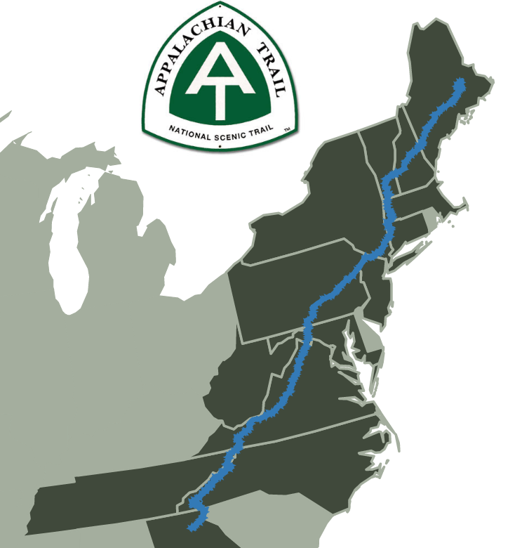
I didn’t collect many stats during my thru-hike of the Appalachian Trail (AT) in 2016, and in some cases I preferred to be a bit ignorant of measurements like how much my pack weighed (It was really heavy, I could tell that by just picking it up. I didn’t need a number). Thankfully, family members recorded my approximate camping location nearly every night by cross-referencing my GPS locater position to waypoints found in Thru-Hiker’s Companion, the official guidebook published by the Appalachian Trail Conservancy.
I went through every entry by hand and noted the mileage of each campsite. I had to correct a few which didn’t align with where I remembered camping, but for the most part the locations were very accurate. I used this to generate a daily mileage plot for the hike.
elevation-D3.html
<script src="https://d3js.org/d3.v4.js"></script>

<div style="text-align: center;">
    <div id="daily-mileage-plot"></div>
</div>

<script>


    // set the dimensions and margins of the graph
    var margin0 = {top: 20, right: 90, bottom: 50, left: 90},
        width0 = 300 - margin0.left - margin0.right,
        height0 = 900 - margin0.top - margin0.bottom;

    // append the svg object to the body of the page
    var svg0 = d3.select("#daily-mileage-plot")
        .append("svg")
        .attr("width", width0 + margin0.left + margin0.right)
        .attr("height", height0 + margin0.top + margin0.bottom)
        .append("g")
        .attr("transform",
                "translate(" + margin0.left + "," + margin0.top + ")");

    // Parse the Data
    d3.csv("/assets/blog/thru-hiking-data-viz/tigger-AT-thru-hike-2016.csv", function(data) {

        // Add X axis
        var x = d3.scaleLinear()
        .domain([0, 26])
        .range([0, width0]);
        svg0.append("g")
            .attr("transform", "translate(0," + height0 + ")")
            .call(d3.axisBottom(x))
            .call(d3.axisBottom(x).ticks(5));
        svg0.append("text")
            .attr("transform",
                    "translate(" + (width0/2) + " ," +
                                (height0 + margin0.top + 20) + ")")
            .style("text-anchor", "middle")
            .text("Daily Mileage");


        // Y axis
        var y = d3.scaleBand()
            .range([ 0, height0 ])
            .domain(data.map(function(d) { return 149 - d.DaySinceStart; }))
            .padding(.1);

        svg0.append("text")
            .attr("transform", "rotate(-90)")
            .attr("y", 0 - margin0.left + 50)
            .attr("x",0 - ( height0 / 2 ))
            .attr("dy", "1em")
            .style("text-anchor", "middle")
            .text("Georgia - Maine");

        svg0.append("g")
            .selectAll("text").remove()
            .call(d3.axisLeft(y))
            .call(d3.axisLeft(y).tickSize(0))
            .select(".domain").remove();

        var myColor = d3.scaleOrdinal().domain([
            "Georgia",
            "North Carolina",
            "North Carolina / Tennessee",
            "Tennessee",
            "Virginia",
            "West Virginia",
            "Maryland",
            "Pennsylvania",
            "New Jersey",
            "New York",
            "Connecticut",
            "Massachusetts",
            "Vermont",
            "New Hampshire",
            "Maine"
        ]).range([
            "#333333"
        ]);


        //Bars
        svg0.selectAll("myRect")
            .data(data)
            .enter()
            .append("rect")
            .attr("x", x(0) )
            .attr("y", function(d) { return y(d.DaySinceStart); })
            .attr("width", function(d) { return x(d.MileageForDay); })
            .attr("height", y.bandwidth() )
            .attr("fill", function (d){ return myColor(d.State); })
            .on("mouseover", function() {
                d3.select(this)
                    .attr("fill", "#337ab7");
            })
            .on("mouseout", function() {
                d3.select(this)
                    .attr("fill", "#333333");
            });

    })

</script>
Elevation
I thought that an elevation profile of the trail in each state would be interesting to add to the data visualization. When looking for resources online, I came across Postholer.com, which is an online resource for trail waypoints. It includes mileage and elevation of many of these points, so I set up a web scraper to aggregate these data into a single file on my computer.
postholer-scraper.py
import requests
from bs4 import BeautifulSoup


def table_to_array(table):
    array = []
    for row in table.findAll('tr'):
        columns = row.findAll('td')
        output_row = []
        for column in columns:
            output_row.append(column.text)
        array.append(output_row)
    return array

def rescale(value, start1, end1, start2, end2):
    return ((value-start1)/(end1-start1))*(end2-start2)+start2


# Postholer has broken the AT into segments defined by starting mileage
# These starting mileages are used for the URLs
sections = [0.0, 53.3, 166.4, 276.5, 393.9, 467.6, 587.9, 703.1, 784.7, 862.0, 979.9, 1026.1, 1124.5, 1223.5, 1299.5, 1408.3, 1503.2, 1613.4, 1706.1, 1750.1, 1856.9, 1963.8, 2064.6]

# Loops through the sections and scrapes waypoints table
# Aggregates to all_data array
all_data = []
header = True
for sec in sections:
    section_data = BeautifulSoup(requests.get("https://www.postholer.com/databook/Appalachian-Trail/3/" + str(sec)).text, "html.parser")
    waypoints = section_data.find("table", {"class": "wptTable"})
    array = table_to_array(table=waypoints)
    if header:
        all_data.append(array[1])
        header = False
    for row in array[2:]:
        all_data.append(row)


# Save select waypoint's description, mile, and elevation to CSV
# Removes waypoints without mileage and elevation data
with open('AT-waypoints.csv', 'w') as outfile:
    number_of_rows = len(all_data)
    for row in range(number_of_rows):
        row_length = len(all_data[row])
        if all_data[row][0] != "" and all_data[row][1] != "" and all_data[row][5] != "":
            for column in [0,1,5]:
                outfile.write(all_data[row][column] + ",")
            if row == 0:
                outfile.write("Rescaled,Highlight")
            else:
                outfile.write(str(round(rescale(value=float(all_data[row][1]), start1=0, end1=2180.0, start2=0, end2=2189.1), 1)) + ",")
            if row != number_of_rows - 1:
                outfile.write("\n")
Because Postholer separates the trail into many sections, I looped through each section and appended the data to an array which was then written to a csv. I used the BeautifulSoup module to extract the mileage table from the website. Over the years, the trail has changed, being extended in certain states. Because of this the mileage in my guidebook did not perfectly align with that on Postholer. In 2016, the Appalachian Trail was officially measured to be 2189.1 miles in length. Postholer instead says that the trail is 2180 miles (measurement date unknown). With the goal of combining these two datasets, I needed to make sense of these different measurements. My imperfect solution was to rescale the Postholer range to match the official 2016 mileage. As this isn’t leading to rigorous study and publication, I thought it’ll work well enough. I also added a “Highlight” column for future work thinking that I may want to highlight certain waypoints on the charts, such as where I camped each night or mountain names.
Here is the plots of the trail elevation profile made in D3.js:
Postholer Data
elevation-D3.html
<script src="https://d3js.org/d3.v4.js"></script>

<div style="text-align: center; margin: 25px 0px;">
    <h4>Postholer Data</h4>
    <select id="stateSelect"></select>
    <div id="elevationPlot"></div>
</div>

<script>

    d3.csv("/assets/blog/thru-hiking-data-viz/AT-states.csv",
        function(data) {
            // add the options to the button
            d3.select("#stateSelect")
            .selectAll('myOptions')
            .data(data)
            .enter()
            .append('option')
            .text(function (d) { return d.State; }) // text showed in the menu
            .attr("value", function (d) { return [d.Start, d.End]; }) // corresponding value returned by the button
        }
    )

    // set the dimensions and margins of the graph
    var margin = {top: 20, right: 20, bottom: 20, left: 60},
        width = 600 - margin.left - margin.right,
        height = 400 - margin.top - margin.bottom;

    // append the svg object to the body of the page
    var svg = d3.select("#elevationPlot")
        .append("svg")
        .style("max-width", "600")
        .attr("viewBox", "0 0 600 400")
        .attr("perserveAspectRatio", "xMinYMid")
        .append("g")
        .attr("transform",
            "translate(" + margin.left + "," + margin.top + ")");

    svg.append("text")
      .attr("transform",
            "translate(" + (width/2) + " ," +
                           (height + margin.top) + ")")
      .style("text-anchor", "middle")
      .text("Mile");

    svg.append("text")
      .attr("transform", "rotate(-90)")
      .attr("y", 0 - margin.left)
      .attr("x",0 - (height / 2))
      .attr("dy", "1em")
      .style("text-anchor", "middle")
      .text("Elevation (ft)");

    //Read the data
    d3.csv("/assets/blog/thru-hiking-data-viz/AT-waypoints.csv",

        // Now I can use this dataset:
        function(data) {
            highlight = data.filter(function(d) {
                return d.Highlight != "";
            })
            // Add X axis --> it is a date format
            var x = d3.scaleLinear()
                .domain([d3.min(data, function(d) { return +d.Rescaled; }), d3.max(data, function(d) { return +d.Rescaled; })])
                //.domain([0, d3.max(data, function(d) { return +d.Rescaled; })])
                .range([ 0, width ]);

            var x_axis = svg.append("g")
                .attr("transform", "translate(0," + height + ")")
                .call(d3.axisBottom(x));

            // Add Y axis
            var y = d3.scaleLinear()
                .domain([0, 6607])
                .range([ height, 0 ]);

            svg.append("g")
                .call(d3.axisLeft(y));

            // Add the line
            var elevation = svg.append("path")
                .datum(data)
                .attr("fill", "#337ab7")
                .attr("stroke", "#337ab7")
                .attr("stroke-width", 0)
                .attr("d", d3.area()
                    //.curve(d3.curveMonotoneX)
                    .x(function(d) { return x(d.Rescaled) })
                    .y0(y(0))
                    .y1(function(d) { return y(d.Elev) })
                );

            function update(range) {
                range = range.split(",")
                state_elevation = data.filter(function(d) {
                    return +d.Rescaled >= +range[0] && d.Rescaled <= +range[1];
                })
                highlight = state_elevation.filter(function(d) {
                    return d.Highlight != "";
                })
                // Add X axis --> it is a date format
                var x = d3.scaleLinear()
                    .domain([d3.min(state_elevation, function(d) { return +d.Rescaled; }), d3.max(state_elevation, function(d) { return +d.Rescaled; })])
                    //.domain([0, d3.max(data, function(d) { return +d.Rescaled; })])
                    .range([ 0, width ]);
                x_axis
                    .attr("transform", "translate(0," + height + ")")
                    .call(d3.axisBottom(x));
                elevation
                    .datum(state_elevation)
                    .attr("d", d3.area()
                        //.curve(d3.curveMonotoneX)
                        .x(function(d) { return x(d.Rescaled) })
                        .y0(y(0))
                        .y1(function(d) { return y(d.Elev) })
                    )
            }

            // When the dropdown is changed, run the updateChart function
            d3.select("#stateSelect").on("change", function(d) {
                // recover the option that has been chosen
                var range = d3.select(this).property("value");
                // run the updateChart function with this selected option
                update(range);
            })

        }

    )
</script>
It took me a little while to figure out how to make the charts responsive. There seems to be a few solutions, but the most elegant that I found attaches the “viewBox” and “perserveAspectRatio” attributes to the svg element.
D3.js Snippet
.attr("viewBox", "0 0 600 400")
.attr("perserveAspectRatio", "xMinYMid")
The elevations profiles are decent, but there seems to be a number of errors within the Postholer data that lead to sharp peaks and inconsistent gaps between waypoints. Because of this, I wanted to look into other options for accessing trail elevation data. I found a GPX file for the entire trail (here, the full resolution version) and extracted the position and elevation data into a csv using a modified version of the Python script found in this blog post, How tracking apps analyse your GPS data: a hands-on tutorial in Python.
gpx-to-csv.py
import gpxpy
from geopy import distance
import math
import numpy as np
import pandas as pd
import haversine
import matplotlib.pyplot as plt


def rescale(value, start1, end1, start2, end2):
    return ((value-start1)/(end1-start1))*(end2-start2)+start2


gpx_file = open("AT-track.gpx")
gpx = gpxpy.parse(gpx_file)
data = gpx.tracks[0].segments[0].points

# Build a pandas.DataFrame from the GPX
df = pd.DataFrame(columns=['lon', 'lat', 'elev'])
for point in data:
    df = df.append({'lon': point.longitude, 'lat' : point.latitude, 'elev' : point.elevation}, ignore_index=True)

# Calculate 3D distances using Haversine formula
# Convert from meters to miles
dist = []
for index in range(df.shape[0]):
    if index == 0:
        dist.append(0)
    else:
        dist_2d = haversine.haversine((df["lat"][index-1], df["lon"][index-1]), (df["lat"][index], df["lon"][index])) * 1000
        elev_change = df["elev"][index-1] - df["elev"][index]
        dist_3d = math.sqrt(dist_2d**2 + elev_change**2)
        dist.append(dist[index-1] + dist_3d / 1609)
df["dist"] = dist

# Rescale measured distance so that it matches the expected distance from guidebook
df["rescaled_dist"] = rescale(value=df["dist"], start1=min(df["dist"]), end1=max(df["dist"]), start2=0.0, end2=2189.1)
df["elev_feet"] = df["elev"] * 3.281    # Convert from meters to feet

df.to_csv("AT-track.csv", index=False)
This code extracts the GPX data into a pandas.DataFrame, then calculates the three-dimensional Haversine distances between the points along the trail using latitude, longitude, and elevation. Interestingly, the GPX file had the calculated trail length at 2138.7 miles, once again compared to the 2189.1 miles shown in the guidebook. To account for this, I once again rescaled the mileage to match the expected length. The new trail elevation plots look very similar to the original one’s that used Postholer data, but with a more uniform and dense distribution of waypoints. This is particularly evident in states such as West Virginia, where there were very few waypoints in the Postholer data. The code for generating this plot is nearly identical, so I won’t redisplay it here. I did need to reduce the number of points that are plotted when displaying the trail in its entirety and with some of the larger states.
GPX Track
Because the starting trail length and rescaled trail length were pretty significantly different, I wanted to ensure that significant waypoints still lined up with the expected mileage. Unfortunately, this was very much not the case; for instance, looking at the trail in New Hampshire, there are many significant mountain summits that I used as reference points.
New Hampshire
The southernmost/leftmost peak is Mount Moosilauke at 4802 feet. The GPX track has this peak at with its highest point at 1773.3 miles (original, dotted line) or 1815.1 miles (rescaled, solid line), whereas according to the guidebook, this peak is at mile-marker 1795.9 (dashed line). Disappointingly, it was pretty clear that this method of rescaling the length of the trail would not properly align points between the two datasets, overestimating the peak’s distance from the southern terminus in Georgia by approximately 20 miles. I needed to figure out where the discrepancies in mileages were coming from and implement a way to solve it. If I am unable to match them, I may need to look into other datasets that are available.
In a future post, I will discuss other methods that I tried for rescaling and bringing these datasets together. All of the code used in this post can be found HERE If you enjoyed this tutorial and want to use this code in your own project, give the repository a star on GitHub and fork the project to your own profile. If you have any questions, create an Issue for the GitHub repository and I will do my best to help!