Updating Website to Jekyll
James Kitchens
January 6, 2021
Jekyll
HTML
CSS
JavaScript

At the start of quarantine in early 2020, I decided to develop a personal website where I could highlight my ongoing and past research projects and write short blog posts on various topics that I find interesting. This website was built with custom HTML, CSS, and JavaScript. As it has grown, I’ve run into numerous scenarios where I’ve had to repeat code and hardcode sections. Creating new blog posts was tedious, as it required specific and long-winded formatting of paragraph elements. I was happy with the design of my website, but wanted to streamline the file structure. Jekyll, originally developed by Shopify, is a static site generator that solves many of these issues by allowing users to create templates that are filled by inputs from Markdown files. In addition to this, Jekyll is supported by GitHub Pages, which allows for free hosting of these sites. There is a plethora of Jekyll templates, known as themes, found online. The first version of my website was actually built using the modern-resume-theme theme developed by James Grant, which served as my introduction to the generator; I ultimately switched to a custom site for the second version to better match my interest in blogging as well as build my skills in front end web development.
So how do I go about converting my static website into Jekyll site? This walk-through will describe Jekyll installation, the beginnings of theme creation, the pros and cons of how I organized my files and templates, and how I have used Jekyll for my personal website to decrease development hassle as a whole. I am still in the process of learning all of the ins and outs of the new generator, so some of the opinions and discussion points may be updated in the future. Because of this, the GitHub repository and codes linked might not match directly with what is found within this blog post, though it will hopefully remain similar.
As a first time user of Jekyll, I would recommend that you start with a pre-developed theme. There’s thousands of them on GitHub and other sites, like jekyllthemes.org. Many of these can be hosted directly through GitHub without having to install anything onto your own computer. Jekyll themes are designed to have their users manipulate information in Markdown and YML files that then are passed through an HTML template and visualized on your website. All sites start with the same structure:
- _config.yml: the configuration settings of your site. Contains elements like your website title and which directories to include in your build
- _layouts: overarching HTML templates, such as for a homepage or blog post
- _includes: smaller HTML templates. These alter sections of the page, such as the navigation bar, call to action, etc…
- _sass: the stylesheets for your site
- assets: additional static files, such as images, scripts, and more
Installing Jekyll
Because I wanted to develop my own theme, I needed to install Jekyll on my computer. I use a Mac, which actually comes with Ruby preinstalled (Jekyll is built off of Ruby). Unfortunately, this almost leads to more difficulty as the computer fights to avoid changing any of these preinstalled files. I tried to follow the official documentation (HERE), but ran into a number of issues that prevented install. I ultimately was successfully by using RVM rather than Homebrew to install the latest version of Ruby, and then returning to the official instructions for installing Jekyll on top of that.
Creating A New Theme
console
jekyll new-theme explorers-portfolio-theme
This command creates a new Jekyll theme called “explorers-portfolio-theme”, including all of the scaffolding needed to get you started. My website is relatively simple; it has a homepage composed of multiple sections as well as smaller pages associated with blog posts that follow a standard template. For the homepage, I wanted there to be six sections:
- navigation bar: at the top of the website for maneuvering through the site
- home: landing page with picture
- bio: headshot, short biography, and skills list
- projects: major research projects from that I wish to highlight. Many of these have produced some sort of communication material (scientific paper, poster, website, etc) that I link to
- blog: posts about topics that I am interested in and feel might be useful to others
- contact bar: contact information for those that want to connect
These sections will have custom content specific to each site. Jekyll allows you to specify a index.md file which contains the front matter to build your site. This will differ for everyone’s site. Below is an example of my index.md file:
index.md
---
layout: home

homepage_background: assets/headshot/background.jpg
title_align: right

headshot: assets/headshot/KitchensJames_Headshot.jpg

bio: |
  Hi, my name is James Kitchens, and I am a Business Consultant with Venebio Group, LLC, aiding in the analysis of clinical and demographic studies. In December 2019, I graduated from Warren Wilson College in Asheville, North Carolina, where I earned a B.S. in Biology and B.S. in Chemistry. While in undergraduate, I worked in the Warren Wilson College Plant Physiology and Genetics Laboratory as a Research Assistant on projects focused around the conservation of human-impacted species in the United States. I am interested in population biology and the impacts of geography on movement and population structure. I enjoy using computational research as a tool for better understanding the natural world.

  In January 2020, I moved to Pomona, California and am excited to explore the West Coast (once it is safe to open back up from quarantine)!

skills:
  - [Python, R, Shiny, HTML, CSS, JavaScript, Git, SQLite]
  - [QGIS, ArcGIS, GRASS GIS]
  - [DNA Extraction, PCR, Fragment Analysis, NMR]

publications:
  - Whipple, A.L., C. Ray, et al. Temporal analysis of fecal glucocorticoid metabolites to explore variation within and among territories of a climate-sensitive small mammal. <i>Conservation Physiology</i> (submitted).
  - Kim et al. An evaluation of remotely sensed and in-situ data sufficiency for SGMA-scale groundwater studies in the Central Valley, California. <i>Journal of the American Water Resources Association</i> (accepted).
  - Webb et al. (2017) <a href="https://www.frontiersin.org/articles/10.3389/fgene.2017.00030/full" target="_blank">Molecular Genetic Influences on Normative and Problematic Alcohol Use in a Population-Based Sample of College Students</a>. <i>Frontiers in Genetics</i>, 8

categories:
  projects:
    rows_to_show: 2
    posts_per_row: 2
    template: "cards/projects.html"
  blog:
    rows_to_show: 1
    posts_per_row: 3
    template: "cards/blog.html"
---
Each line corresponds to a different input into the theme; some that are included are optional inputs, other’s are very necessary to the design of the site. Let’s walk through the various sections and note how the site is built. Starting at the top, the navigation bar was pulled nearly directly from my original site but with some reusability.
navbar.html
<div id="topnav">

    {% if page.layout == 'home' %}
        <a class="section-title" id="Logo" href="javascript:void(0);" onclick="goTo('#home')">
            <i class="fas fa-hiking fa-lg logo" title="{{ site.name }}"></i>
        </a>
        <a class="section-title active" id="Home" href="javascript:void(0);" onclick="goTo('#home')">Home</a>
        <a class="section-title" id="Bio" href="javascript:void(0);" onclick="goTo('#bio')">Bio</a>
        {% for category in site.categories %}
            <a class="section-title" id="{{ category[0] | capitalize }}" href="javascript:void(0);" onclick="goTo( '{{ '#' | append: category[0] }}' )">{{ category[0] | capitalize }}</a>
        {% endfor %}
    {% else %}
        <a class="section-title" id="Logo" href="{{ '/#home' | relative_url }}">
            <i class="fas fa-hiking fa-lg logo" title="{{ site.name }}"></i>
        </a>
        <a class="section-title" id="Home" href="{{ '/#home' | relative_url }}">Home</a>
        <a class="section-title" id="Bio" href="{{ '/#bio' | relative_url }}">Bio</a>
        {% for category in site.categories %}
            <a class="section-title" id="{{ category[0] | capitalize }}" href="{{ '/#' | append: category[0] | relative_url }}">{{ category[0] | capitalize }}</a>
        {% endfor %}
    {% endif %}

    {% if site.social_links.CV.link %}
        <a class="section-title" id="CV" href="{{ site.social_links.CV.link | relative_url }}" target="_blank">CV</a>
    {% endif %}

    <a href="javascript:void(0);" class="burger" onclick="hamburger()">
        <i class="fa fa-bars"></i>
    </a>

</div>
The major difference now is that the navigation bar template needs to work slightly differently when users are on the homepage versus on a blog post. On the homepage, navigation links refer to sections that are found somewhere on the homepage, either above or below the users current position, causing the screen to scroll to those sections. This scrolling behavior would not work for when you are on a blog posts as the sections don’t exist on that page, so when ‘page.layout’ is not home, navigation links teleport the user to the respective section on the homepage. Lastly, the Home, Bio, and CV sections are hardcoded within the site, whereas Projects and Blog are not. This will be explained in more depth later on in this post.
Next, we have the landing section of the homepage. This use to be the animated parallax mountains that I made in p5.js, but I wanted to change it up for this latest version.
home.html
<div id="home">
    {% if page.homepage_background %}
        <div class="background" style="background-image: linear-gradient( 90deg, rgba(0, 0, 0, 0), rgba(0, 0, 0, 0.75)), url('{{ page.homepage_background | relative_url }}');"></div>
    {% else %}
        <script src="{{ '/assets/scripts/parallax-mountains.js' | relative_url}}"></script>
        <div id="background"></div>
    {% endif %}
    <div class="textbox {{ page.title_align }}">
        <h1 class="title">{{ site.name }}</h1>
        <p class="desc">{{ site.job_title }}</p>
        <div class="links">
            {% for link in site.social_links %}
                <a target="_blank" href="{{ link[1].link | relative_url }}">
                    <i class="{{ link[1].icon }} link" title="{{ link[0] }}"></i>
                </a>
            {% endfor %}
        </div>
    </div>
</div>
There are two options. Within the index.md file, you can select a homepage_background to use for the landing page. Depending on the composition of the picture, you can then align your title box to match. In my case, I went with my partner’s picture of me from Angel’s Landing in Zion National Park and aligned the title box to the right. There is a slight black gradient added to the background image to help the text stand out (I still need to update this gradient to match the title alignment). In mobile view, the title box is automatically center aligned. Lastly, if a homepage_background is not defined, the background will default to the parallax mountains.
The bio section is very straight forward with Liquid being used mostly to organize the skills section.
bio.html
<div id="bio" class="section">
    {% if page.headshot.size > 0 %}
        <div style="margin: auto auto 60px auto; background-image:url('{{ page.headshot | relative_url }}'); height: 300px; width: 300px; border-radius: 50%; background-position: center; background-size: cover;"></div>
    {% endif %}
    {% if page.bio.size > 0 %}
        {{ page.bio | strip | markdownify }}
    {% endif %}
    {% if page.skills.size > 0 %}
        <div style="margin: 50px 0px;">
            {% for skillset in page.skills %}
                {% if forloop.first %}
                    <div class="cat" style="text-align: center; margin: 0px 0px 2.5px 0px;">
                {% elsif forloop.last %}
                    <div class="cat" style="text-align: center; margin: 2.5px 0px 0px 0px;">
                {% else %}
                    <div class="cat" style="text-align: center; margin: 2.5px 0px;">
                {% endif %}
                        {% for skill in skillset %}
                            <div class="background">
                                <p class="skill">{{ skill }}</p>
                            </div>
                        {% endfor %}
                    </div>
            {% endfor %}
        </div>
    {% endif %}
    {% if page.publications.size > 0 %}
        <h2>Publications</h2>
        {% for pub in page.publications %}
            <p><b>{{forloop.rindex}}. </b>{{ pub }}</p>
        {% endfor %}
    {% endif %}
</div>
This is the first time that I used ‘forloop’ attributes (for displaying the skill categories), including ‘forloop.first’ and ‘forloop.last’, which allow you to treat the first and last elements in the loop differently than those in the middle. Also, if the developer has a publications, I made it so that you can add those to the site as a list.
The previous sections had each had associated HTML file within the _includes directory. As both projects and blog posts are chronologically ordered, I decided to treat these sections in a very similar way (and actually reuse large sections of code in the process). Looking within the _includes directory, you won’t find a projects.html or blog.html file. Instead, these two sections are generated within the categories.html file.
categories.html
{% for category in site.categories %}

    {% capture category_name %}{{ category[0] }}{% endcapture %}

    {% capture section_color %}{% cycle '#BBBBBB', '#FFFFFF' %}{% endcapture %}

    {% assign rows_to_show = page.categories.[category_name].rows_to_show %}
    {% assign posts_per_row = page.categories.[category_name].posts_per_row %}
    {% assign template = page.categories.[category_name].template %}

    {% assign to_show = rows_to_show | times:posts_per_row %}
    <div id="{{ category_name }}" class="section" style="background-color: {{ section_color }};">
        <h1 style="text-align: center;">{{ category_name | capitalize }}</h1>
        {% for post in category[1] %}
            {% if forloop.index > to_show %}
                <div class="post col-md-{{ 12 | divided_by:posts_per_row }} col-lg-{{ 12 | divided_by:posts_per_row }} hide{{ category_name | capitalize }}">
            {% else %}
                <div class="post col-md-{{ 12 | divided_by:posts_per_row }} col-lg-{{ 12 | divided_by:posts_per_row }}">
            {% endif %}
                    {%- include {{ template }} -%}
                </div>
        {% endfor %}
        {% assign need_placeholder = category[1].size | modulo:posts_per_row %}
        {% if need_placeholder != 0 %}
            {% assign number_of_placeholders = posts_per_row | minus:need_placeholder %}
            {% for placeholder in (1..number_of_placeholders) %}
                {% if category[1].size > to_show %}
                    <div class="post placeholder col-md-{{ 12 | divided_by:posts_per_row }} col-lg-{{ 12 | divided_by:posts_per_row }} hide{{ category_name | capitalize }}">
                {% else %}
                    <div class="post placeholder col-md-{{ 12 | divided_by:posts_per_row }} col-lg-{{ 12 | divided_by:posts_per_row }}">
                {% endif %}
                        <div class="card"></div>
                    </div>
            {% endfor %}
        {% endif %}

        <div style="width: 100%; text-align: center;">
            {% if category[1].size > to_show %}
                <a style="font-size: 2em;" id="{{ category_name | capitalize }}Arrow" href="javascript:void(0);" onclick="{{ category_name }}Arrow()">
                    <i class="fas fa-chevron-down arrow" id="arrow{{ category_name | capitalize }}"></i>
                </a>
            {% else %}
                <a style="font-size: 2em;">
                    <i class="fas fa-chevron-down arrow" style="color: {{ section_color }};"></i>
                </a>
            {% endif %}
        </div>
    </div>

{% endfor %}
Jekyll allows users to identify categories for their blogs to better organize posts around topics. Each post, whether a project or blog post, generates an associated card on the homepage within its respective category; the format of these cards is found within the _includes/cards directory. Posts are stored within the _posts directory of their category as markdown files, named in the following format: YYYY-MM-DD-“title”.md. Projects and blog posts require slightly different front matter within the markdown files that used to build the card.
cards/projects.html
<div class="card" style="background-image: url('{{ post.thumbnail | relative_url }}');">
    <div class="overlay">
        <div class="content" style="position: absolute; top: 50%; left: 50%; transform: translate(-50%, -50%); width: 90%;">
            <h2 class="name" style="color: #FFFFFF; text-align: center;">{{ post.title }}</h2>
            <div class="desc">
                <div class="links" style="text-align: center; font-size: 2em; padding: 10px 0px;">
                    {% for link in post.links %}
                        <a target="_blank" href="{{ link.link | relative_url }}" style="padding: 0px 5px; text-decoration: none;">
                            <i class="{{ link.icon }} link" title="{{ link.name }}"></i>
                        </a>
                    {% endfor %}
                </div>
                <p>{{ post.short_desc }}</p>
            </div>
        </div>
    </div>
</div>
example project
---
title: "Central Valley Water Resources"
date: "November 15, 2020"
thumbnail: "/assets/projects/central-valley-water-resources/thumbnail.jpg"
links:
    - {name: "Website", icon: "fas fa-link", link: "https://develop.larc.nasa.gov/2020/spring/CentralValleyWater.html"}
short_desc: "Using remote sensing (satellite) data to monitor groundwater conditions in California's Central Valley."
---
With this method, you can add as many post categories as you would like, and they will be displayed on the homepage within their respective section. Links to the sections are also automatically added to the navigation bar at the top of the site.
Blog posts have more content associated with them as they have their own post pages. Below the front matter of the file, blogs contain all of the content and pictures for the post. Here is an shortened example of blog post:
example blog
---
layout: post
link: /blog/streamflow-and-precipitation
title: Streamflow and Precipitation
github-link: https://github.com/kitchensjn/streamflow-and-precipitation
date: December 17, 2020
skills: [R, Hydrology, USGS, NOAA]
desc: With all of the rain coming to the southeastern United States, I started to think about how it is affecting the river levels.
thumbnail: /assets/blog/streamflow-and-precipitation/thumbnail.png
---
{:.images}
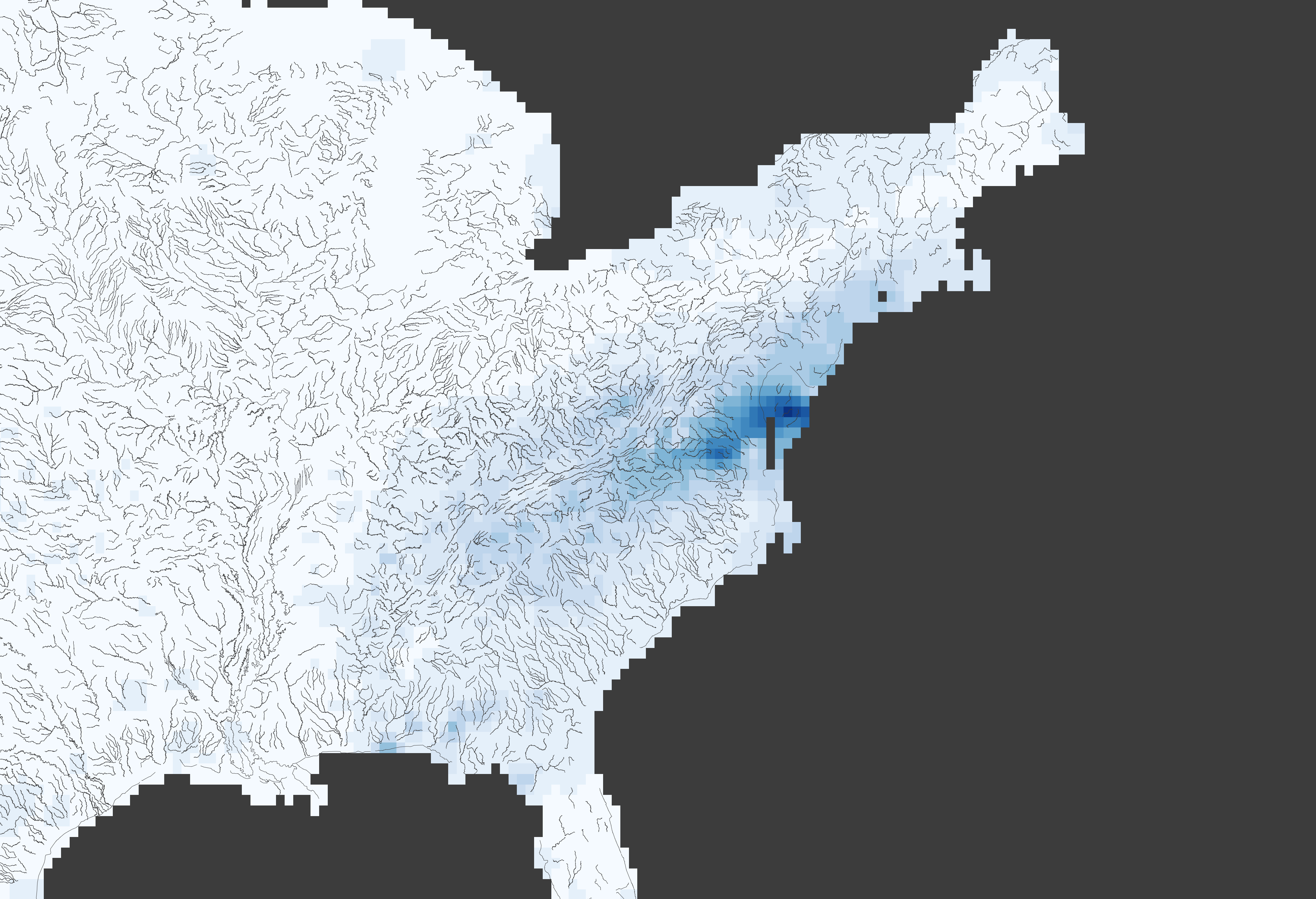
With all of the rain coming to the southeastern United States, I started to think about how it is affecting the river levels. USGS has established streamflow gauges on many of the major rivers across the country; they have also developed an R package (dataRetrieval) that gives simple access to these gauge measurements and more. In this blog post, I’m going to talk about using functions from the dataRetrieval package to access streamflow gauges, delineate river watersheds, and then compare these datasets with other publicly available raster datasets, such as gridded climate datasets from NOAA’s Physical Sciences Laboratory.
This post requires the following packages to be installed and loaded:
- devtools
- dataRetrieval
- tidyr
- ggplot2
- raster
- ncdf4
USGS provides public datasets with numerous applications; the Central Valley Water Resources project during the NASA DEVELOP program greatly utilized these datasets, particularly groundwater field stations measurements from the National Water Inventory System. USGS researchers continue to develop and maintain the dataRetrieval package to aid in accessing these datasets and other tools. The dataRetrieval package can be installed either through CRAN or GitHub. NOTE: There may be version differences depending on the installation method. For the rest of this post, we will be using the GitHub version, which, at the writing of this post, had most recently been updated with functions necessary for my analysis.
I now can write all of my blog posts as markdown files, rather than hardcoded HTML, which is much easier.
The last section is the contact bar that is displayed at the bottom of the site. This is built using site information found in the _config.yml file. If you are on the homepage, the contact bar pops up as you scroll down, whereas when you are on another page, it is permanently stuck to the bottom of the site. Other than that change, the contact bar is a direct copy from my original site.
contactbar.html
{% if page.layout == 'home' %}
    <div id="contact" class="contactBar unstick">
{% else %}
    <div id="contact" class="contactBar">
{% endif %}
        <p class="info infoHide">{{ site.location }}</p>
        <p class="info infoHide">|</p>
        <p class="info">{{ site.email }}</p>
        <p class="info infoHide">|</p>
        <p class="info infoHide">{{ site.phone }}</p>
    </div>
Those are the main changes to the site now that it is built with Jekyll. I have found that Jekyll greatly speeds up my development time due through its use of Liquid and its ability to convert markdown files into stylized posts. It’s easy integration into GitHub Pages is also a huge plus!
All of the code used in this post can be found in the explorers-portfolio-theme or on my personal site’s GitHub repository (HERE). If you enjoyed this tutorial and want to use this code in your own project, give the repository a star on GitHub and fork the project to your own profile. If you have any questions, create an Issue for the GitHub repository and I will do my best to help!