Visualizing Human Genetic Diversity
James Kitchens and Graham Coop
May 16, 2023
Genetics
D3
Python
R
A key insight from human genetics is that, as a species, we are all very genetically similar to one another and share much of our genetic variation. Our genome can be depicted as a string of letters (A, T, G, and C), referring to the four nucleobases found in DNA. Two human genomes picked at random are identical at ~99.9% of sites (e.g. Mallick et al. 2016); in that small fraction that doesn’t match (~1/1000 sites), your chromosome might carry an A while the other person’s chromosome carries a T. The majority of sites with variation have no known function; indeed, carrying an A instead of an T may have no discernible effect on your traits. Much of the common genetic variation is shared among human groups (Lewontin, 1972). Human geneticists are interested both in understanding which sites in the genome are functional and in unraveling the subtle differences between individuals and groups that highlight our shared history.
Due to the complexity of data involved, understanding and visualizing patterns of human genetic variation is often challenging. One helpful place to start is to visualize the global frequencies of variants at individual sites within the genome to see how variation is shared - check out the Geography of Genetic Variants Browser from the Novembre Lab for a nice interactive tool (Marcus & Novembre, 2016). However, because the human genome contains approximately 3 billion sites, it would take a few lifetimes to walk through the genome in this manner, so researchers often turn to genome-wide summary statistics to capture patterns of genetic variation.
We wanted to share some resources that we’ve been putting together for teaching human genetics using data from the 1000 Genomes Project, inspired by Donovan et al. (2019) and Biddanda et al. (2020). These visualizations first center on the variation in a set of diverse samples from the Americas (see Figure 2) before expanding to include more globally distributed examples. In a small sample of people, we expect that they vary at only a small fraction of sites in their entire sequenced genomes.1 Most of this variation is rare, and though these rare variants can be medically salient, they are the properties of specific people and their immediate families, rather than of the larger human groups. To learn about more widely shared variation and following methods similar to those in Biddanda et al., we defined a variant as “common” in a sample if it was found in more than 5% of people’s chromosomes and then filtered the data based on this criterion.
Figure 1 - The scale of common variants in the Americas compared to the human genome. The area of each circle is scaled proportionally by the number of sites in that category. The small blue circle corresponds with the number of common variants; “common” is defined as having a minor allele frequency of greater than 5% in at least one of the samples.
The small blue circle in the above figure captures just how little variation rises to this frequency in the Americas. As the rest of this post focuses on the sharing of these common variants, it’s important to maintain perspective regarding the scale of these differences relative to the size of the human genome.
There are seven different samples from the Americas in the 1000 Genomes Project dataset (as described in Biddanda et al.), each sample being made up of 60-105 people, and we counted the number of common variants found in each sample.2
Figure 2 - Number of common variants in seven samples from the Americas. The area of each circle is proportional to the number of common variants within that sample from the 1000 Genomes Project. A “common” variant is defined as having a minor allele frequency of greater than 5%, where the minor allele identity is determined by its global allele frequency (its frequency across all samples in the 1000 Genomes Project). The number of individuals within each sample has also been included to ensure that this quantity is relatively consistent between samples.
The levels of genetic diversity, shown as differences in the number of common variants, vary between samples: African Caribbean in Barbados (ACB) and African Ancestry in Southwest US (ASW) display the highest levels of variation. Similar to Figure 1 from Donovan et al. (2019), we implement an Euler diagram to visualize the amount of overlap in common genetic variation between samples (Figure 3). This style of visualization is like a Venn diagram, with the added property that the areas and overlaps of the shapes are proportional to the number of common variants in the corresponding samples.
Figure 3 - Overlap in common variants between samples from the Americas. This Euler diagram is interactive; hovering over the ellipses displays a popup with information about the samples. It is not mathematically possible to generate ellipses with a given overlap without distortions to the areas. See the Technical details section (below) for statistics quantifying the slight errors in this and following Euler diagrams.
It’s clear from this figure that the majority of common variants are not unique to a single sample. Instead, they are often widely distributed and shared between samples, resulting in a large degree of overlap between ellipses. The African Caribbean and African American (ACB and ASW) samples share nearly all of the common variation found in other samples. However, as noted above, they also have greater amounts of genetic variation compared to that found in the other samples (larger area), and some of that variation is not common in the other samples from the Americas. This does not mean that these variants are completely absent from the other groups, but instead, that these variants are rare or undetected in the other samples included in the figure. For example, maybe 10% of people’s chromosomes in the ACB sample carry a T instead of an A at a particular site, but this T is found in only 1% of the CEU sample.
To look at the overlap in a different way, we first considered the variation that is common (>5%) in a given sample and then identified in which other samples the variant is also common.
Figure 4 - Sharing of common variants found in each sample from the Americas. Each diagram highlights a different sample, identified in the title, that was used to filter the variants down to only those that were common in the sample. The sizes of each plot are proportional to the number of variants included in the analysis (sizes are not proportional to previous figures). See Figure S1 near the bottom of this post for an alternative visualization of this figure.
This method of filtering results in a Euler diagram where the ellipse of the highlighted sample completely encircles the other ellipses. A sample with greater numbers of common variants that are not common in other samples will show a larger disparity in size compared with the other ellipses. As before, these figures illustrate the high degree of sharing of variation among samples in the Americas. The African Caribbean in Barbados (ACB) and African Ancestry in Southwest US (ASW) samples contain the most genetic diversity, with some of this variation being shared only between those two samples. In comparison, there is somewhat less common variation (small diagram size) in the other samples and nearly all of it is shared.
Zooming back out and putting Figure 3 back onto the scale of the whole genome, the Euler diagram shrinks down to match the fraction of common variants in the genome.
Figure 5 - Common variants in perspective. An Euler diagram of the common variants in samples located in the Americas relative to the scale of the human genome. As a small note, the positions and orientations of ellipses within the Euler diagram differ slightly from Figure 3. This is because the eulerr package gives varied results with each run due to random starting conditions within the algorithm.
Genetic diversity in the Americas reflects the history of colonialism and the transatlantic slave trade, which has moved people from across the globe into the region over the past few hundred years. Given this, you may wonder whether the high degree of overlap reflects this recent history of the Americas or whether it is representative of sharing that is present in geographically distant samples. To look into this question, we created a Euler diagram with five samples, one from each of the broad geographic groupings used by Biddanda et al.
Figure 6 - Overlap in common variants between samples from global samples. An interactive Euler diagram of the common variants in five geographically distant samples: Bengali in Bangladesh (BEB), Han Chinese in Beijing, China (CHB), British in England and Scotland (GBR), Mexican Ancestry in Los Angeles, California (MXL), and Yoruba in Ibadan, Nigeria (YRI).
Overall, this diagram has a very similar structure to the diagram created with the samples from the Americas. There is a high degree of overlap between all of the samples, with the higher genetic diversity of the Yoruba in Ibadan, Nigeria sample resulting in a larger ellipse that stretches outside of the cluster of other ellipses. This pattern matches the one of high diversity in the African Caribbean and African American (ACB and ASW) samples from the Americas described above. Even when considering quite geographically distant samples of humans, the dominant pattern is that of shared genetic variation.
Lastly, given this global view, we can zoom in and look at how variation is partitioned at finer geographic scales by using all 26 samples within the 1000 Genomes Project dataset. We see that samples from Africa contain the greatest amount of genetic diversity. Much of that common genetic variation is shared, but each sample contains some variation not found in other samples. There’s a slight reduction in the variation present in samples whose recent ancestors lived outside Africa, consistent with the view that humans evolved in Africa, and when humans first migrated out of Africa, they took with them only a subset of the genetic diversity present in Africa.
Figure 7 - Sharing of common variation within geographic regions. Five interactive Euler diagrams of the 26 global samples using the broad geographic groupings from Biddanda et al. 2020.
It’s easy for us to fall into the trap of thinking that humans are very genetically different. Historically, our ideas about the structure of human biological variation have been shaped by a few visible physical traits, notably skin color, that have a geographic pattern. But the genetic variants contributing to skin pigmentation are unrepresentative of the more general patterns of genetic sharing present among groups of people sampled from across the world. The genetic changes involved in skin pigmentation differences can show striking geographic patterns (e.g. SLC24A5), but that is because they have been shaped by strong local adaptation to the climatic conditions that people encountered as they moved around the world. These loci are fascinating examples of adaptation but are also the exception in comparison to the high degree of sharing that we see for most of human genetic variation.
Acknowledgments
We thank John Novembre, Arjun Biddanda, Molly Przeworski, Doc Edge, and the Coop Lab for their help during the editing of this post.
Technical details
We used the geovar package in Python to group the ~92 million variants included in the 1000 Genomes Project based on minor allele frequency (MAF). Variants were separated into five bins based (MAF=0%, 0%<MAF<1%, 1%<MAF<5%, 5%<MAF<10%, and MAF>10%), though two bins would have sufficed for this analysis (MAF<5% and MAF>5%). We used the eulerr package in R to calculate the position and orientation of ellipses in the Euler diagrams. Unfortunately, exactly proportionally scaling the area of every region of this diagram becomes difficult to impossible as you increase the number of sets, or samples. Because of this, we have included two goodness-of-fit measurements provided by the eulerr package and described in further details in the package’s tutorial. For both measurements, values closer to zero have less error. Below is a table with these measurements for all of the Euler diagrams presented in this post:
| figure | stress | diagError |
|---|---|---|
| 3 | 4.53E-04 | 0.019573681 |
| 4_ACB | 1.09E-04 | 0.008677686 |
| 4_ASW | 1.52E-04 | 0.0133913503 |
| 4_CEU | 1.04E-04 | 0.016955049 |
| 4_CLM | 3.08E-04 | 0.0260526896 |
| 4_MXL | 2.53E-04 | 0.0236936357 |
| 4_PEL | 1.89E-04 | 0.0181390286 |
| 4_PUR | 3.58E-04 | 0.0288044056 |
| 5 | 1.09E-09 | 0.0001789465 |
| 6 | 2.30E-03 | 0.0198055721 |
| 7_Africa | 1.19E-03 | 0.027619266 |
| 7_Europe | 6.39E-07 | 0.0004395497 |
| 7_South_Asia | 6.41E-04 | 0.0458260097 |
| 7_East_Asia | 5.77E-04 | 0.0410841878 |
| 7_Americas | 4.53E-04 | 0.019573681 |
The package also breaks down error by set overlap to better understand exactly which sections are over-/underrepresented by the visualization, though that is not included here. With all of that being said, these diagrams offer a unique visualization method that can be particularly useful for more qualitative interpretations of the population relationships. We converted the output of eulerr into a JSON format and passed this to JavaScript for plotting using D3.js. Plotting is possible directly from R, but we used D3.js for its customizability and support of interactive figures. All of the figures (alongside the code we used to generate them) can be found here.
Additional figures
The following figures offer alternative methods of visualization to those within this post. Details about these figures are provided in the figure captions.
Figure S1 - Sharing of common variants found in each sample from the Americas. Seven interactive "coffee stain" diagrams, an alternate visualization of Figure 4. The colored area is proportional in size to the number of common variants within the highlighted sample, identified in the title, that aren’t shared with another sample. Within each subfigure, the ellipse on the bottom corresponds with the highlighted sample and is filled in with that sample’s respective color. All other ellipses are filled in with white and stacked on top, thus giving the appearance of cutting out the area and leaving only the common variants that aren’t shared with another sample. If you hover over the diagram, the exact orientation of the other ellipses become more apparent.
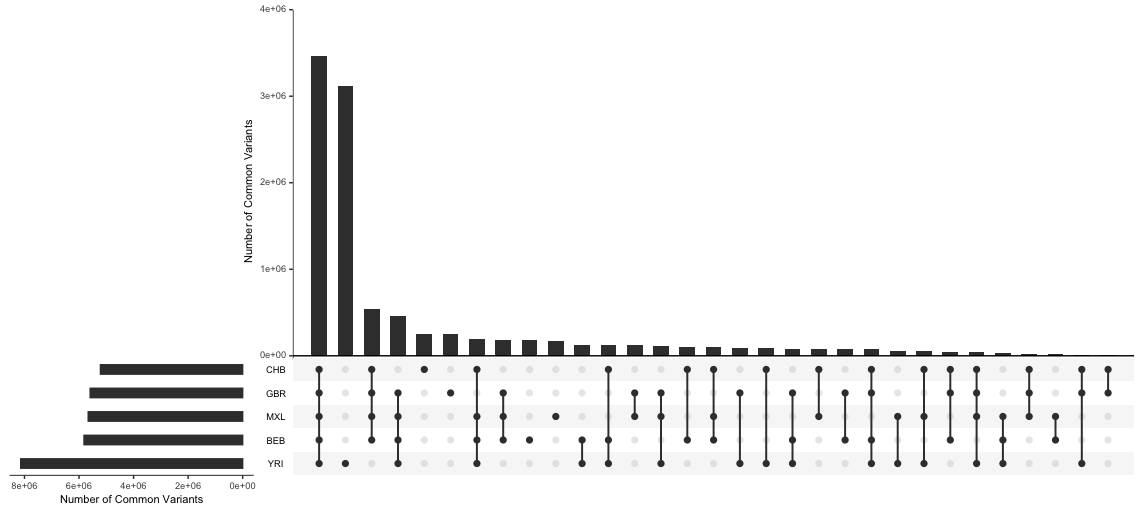
Figure S2 - Sharing of common variation within geographic regions. An UpSet plot, an alternative visualization of Figure 6. UpSet plots, created by Lex et al. (2014), are useful for handling large numbers of sets. They can communicate the exact overlap between sets, unlike Euler diagrams (as discussed in the Technical details section), but are also a bit more challenging to read as there are multiple subfigures. To draw comparisons with the Euler diagrams, the horizontal bar graph on the bottom left depicts the areas of the ellipses and the vertical bar graph shows the areas of the overlaps between ellipses referenced usings dots in the bottom subfigure.
Citations
Mallick et al. (2016) The Simons Genome Diversity Project: 300 genomes from 142 diverse populations. Nature 538, 201–206
Lewontin (1972) The Apportionment of Human Diversity. Dobzhansky, T., Hecht, M.K., Steere, W.C. (eds), Evolutionary Biology
Marcus & Novembre (2016) Visualizing the Geography of Genetic Variants. Bioinformatics, Volume 33, Issue 4
Donovan et al. (2019) Toward a more humane genetics education: Learning about the social and quantitative complexities of human genetic variation research could reduce racial bias in adolescent and adult populations. Science Education, Volume 103, Issue 3
Arjun Biddanda, Daniel P Rice, John Novembre (2020) A variant-centric perspective on geographic patterns of human allele frequency variation. eLife, 9:e60107
Lex et al. (2014) UpSet: Visualization of Intersecting Sets. IEEE Transactions on Visualization and Computer Graphics, Volume 20, Issue 12
1Indeed, if we sequence the entire population of the world, we’d see nearly every site being variable in someone. But these variants would be vanishingly rare in the population, overall.
2It would be interesting to explore rarefaction approaches to account for the differences in the sample size (Cotter et al. 2023).